Friday 30 October 2009

Rude.

For my research into the Elmwood brief I have been looking into typography and how you can change peoples views and in our tutorial we all got talking about this piece of work:

http://www.creativereview.co.uk/images/uploads/2009/04/cunt.jpg
I get what shes trying to do but I really don't like this very much. Good for my research though.

Friday 9 October 2009

Rationale

Surprisingly I have really enjoyed writing this blog, although sometimes I know there could have been other things I added which I just didn't have time to do; it's a really good way to almost log your knowledge and keep a record of it. It has also allowed me to get different points of view and added another side to my knowledge of certain things. I think this would be such an effective way of gathering information (although not always factual) for my dissertation.

I have to say although the blog started off with a few things I didn't really care about although some were just important issues, my blog then evolved into a personality of its own decided by the posts I wrote. Writing this blog has made me more focused on what I actually write, it made me rethink my dissertation subject, as I know doubt I would be able to write in depth about that subject.

Throughout this project I have been reading other blogs and have found them very interesting, it is great to see what other people are passionate about and what drives them. Although I think it could have been more effective if when reading someone else’s post we had put links to similar posts so we could discuss conflicting or similar views or opinions.

Unsurprisingly the post with the most comments was my post on advertising: is to blame for binge drinking? Although we can all see both sides of this argument, many came to the same conclusion that blaming binge drinking on advertising is farcical. Obviously to me and I believe many other people the issues like this and product placement posts are great for dissertations and the comments other people have left are also a great way of getting another point of view. Current views of important issues became apparent when you could see trends emerging between various blogs for example the number of posts on Michael Jackson’s death, Product Placement and Advertising Alcohol.

One of the most intriguing things that has happened to me whilst completing this blog, I have started to read again! I have been buying The Times most weeks and getting whichever recommended read of the week book that is £2.99 with it, I forgot how much I loved reading and it was interesting to write up a review of them, in some way this might help me with my dissertation review. I hope after this blog to continue my renewed love for reading.

From this blog I have taken time out to visit different places, to see a little bit more. When I was in Turkey I went to see Ephesus; one of seven wonders of the ancient world. I wouldn’t have normally gone to see this, but I’m really glad I went to see it as it was fascinating, it was almost overwhelming the size and the excavation they have done on it.

I had no specific format to my blog, each was slightly different, this depended on the time and day I was writing them up. My titles were occasionally well thought out, but sometimes just straight to the point, that meant people could choose to read if they deemed the title interesting enough. I chose my title Differences Challenge Assumptions from the beginning; it was a anonymous quote I found which I thought was quite interesting, as I set out to do different things and to challenge what I normally thought or was interested in. I took a bizarre photograph of a slug on the end of a stick and decided that this might be quite interesting. Bizarre and different was the image I wanted to convey.

Overall, despite this project being slightly time consuming (at times) I have thoroughly enjoyed it and reading other peoples. I hope to continue this blog over the coming year, to read other people’s and to collect my thoughts in an organised way, that I have stored until a later date in case I need them. I hope it will be able to help me collect my thoughts for my dissertation and my independent project. If I could redo this part of my blog I would definately visit more galleries and dedicate more time to writing up about the different artists I had seen and also go and see more films and review them. Hopefully I will be able to fulfill this is the coming year.

Tuesday 6 October 2009

Lloyds Building London

http://upload.wikimedia.org/wikipedia/commons/a/a8/Londres_330..jpg

I don't know if I have ever seen anything more ugly. It is sometimes refered to as the inside-out building, for obvious reasons. It was designed by Richard Rogers and built between 1978 - 1986 and Bovis were the contractors.

The building is innovative for having all its services on the outside; lifts, staircases, electrical power units and water pipes, to leave an uncluttered space on the inside. This also means that they never have to shut off any floor at any given time, if anything goes wrong; water, electric etc, the firm can get into the building and carry on while maintenance work continues on the outside.

Despite this it does have escalators on the inside, which look amazing!

File:Inside Lloyd's of London.jpg

Extraordinary building, beautiful? I don't think so.

Gold is desirable.

Gold is at its most valuable right now and don't I know it. My Gosh! How many ads have been put on each channel from several different companies asking people to trade gold in. Here are just a few logo's from the companies I have seen advertised on day time telly.

CashMyGold.co.uk

Cash4Gold Logo  postgoldforcash.com

This is such a good example of advertising that meets the demand of this economic climate, especially as one of the photos used a stock photo as its logo. They have been generated quickly and have not had that much money thrown at them as you could tell if you had seen them. The day time television viewers, the stereotypical; no job, no money, would love these advertised asking you to send in your gold to make a quick buck, although they don't state what type of money they will make on YOUR gold.

I am getting a bit bored of them now and unfortunately I have no gold to send in so I could make a bit of money!

Sunday 4 October 2009

So Rio Got the 2016 olympics..

Rio 2016 Olympic bid logo This is the candidate logo that is currently being used for the RIO Olympic Games until an official logo is announced. I can't seem to understand why all recent olympic logos are lacklustre; we won't discuss the England fiasco, but Rio's logo should be fun and vibrant to convey the personality of its city!

This logo uses bright colours that are neither here nor there and the actual design seems washed out. From what I can gather about Rio its an exciting and bright city, with a fantastic culture, this should be shown in their logo for the world to see.

I wanted to see what their website was looking like in comparison to this logo, but unfortunately the site isn't working, let's hope that is not a sign of what the Rio Olympics has in store!
http://www.rio2016.org.br/en/Rio2016/

WE ARE ENGLAND


Corporate Edge has designed a new brand image for the England Squad for the commonwealth games. I really like this logo, its fresh and clean yet has a powerful and strong impact which is obviously something England as a Country want to convey when competing in the Commonwealth Games.

This looks very rugby-esque, similar to the type of branding you see for English Rugby.

Friday 2 October 2009

Ratings..

After reading up on certain films that have been banned, its got me thinking about the similarities and differences between films and advertising.

http://www.newsarama.com/preview_images/dcnew/dec08/7/tcm_cut_cv2.jpgThe argument is that a film could "promote" something e.g. "Clockwork Orange" promotes "Ultra-violence" yet when it was banned this just encouraged people to want to see it. Therefore banning a film has an opposite effect.

Advertising on the other hand, we all argue cannot physically force someone to do something, for example if we were advertising a new chainsaw that was strong enough to cut through a skull, this does NOT mean that people would automatically go out and buy a chainsaw and start hacking people's heads off. Yet it would mean we were "promoting" violence, hence the ad would get banned. Similar to films, this technique is often used in advertising e.g. Benetton Ads, we all know about although they have been banned! Weird.

So as we would not want to be advertising rape or murder, do we as designers have an upper hand on the directors and writers of films who do in some ways "promote" these things. Should these people be more responsible about the power of persuasion and promotion that they have on a large audience?

Clockwork Orange, Worth Watching?

http://fleshisgrass.files.wordpress.com/2008/03/eyes.gif

Since I have only watched half this film I can only comment on the half I have watched. I have heard people harping on about this film for years and one day off from work I decided to watch it; despite it being half 11 in the morning. I'm not sure why but I never really want to watch a horror/sick film in the morning they are more evening/night films!


I had previously read up about the film and the story is actually quite interesting and the in theory I do believe something like the techinques used in Clockwork Orange could work, but obviously as the story tells they do not!

Unfortunately this film lacks something and I think its mainly due to this generation X we talk about, The British Board of Film Censors (BBFC) originally released the film uncut with an X rating, but later received many complaints that "the film would damage society by inspiring teenagers to violence." Throughout 1973/74 police linked cases of teenage violence to "Clockwork Orange."

In response Kubrick had the film withdrawn from the country even though it had already been running for 61 weeks. This was not due to BBFC, it was because Kubrick and his family had been recieving death threats. It was not until 1999, the year of Kubrick's death that the film was legally permitted to be shown in Britain again.

Despite all this I do not find this film all that horrendous in terms of types of horror and gore we see in films now-a-days, Clockwork Orange doesn't come very high. Although I do see the horrific side of it, It didn't shock me as much as it may have shocked my mum 30 years ago at my age!

A film would have to go so far over the line these days to be banned,  I don't know if I would want to see a film that had to be officially banned in noughties!

Other films I didn't find that horrific or scary that were also banned in Britain: Texas Chainsaw Masscre, The Exorcist (also nominated for 10 Oscars, won 2) and The Last House on the Left which I have heard is bad but not all THAT bad.

This surely is why advertising these days misses certain target markets, as we cannot offend the other generations. Generation X are not affected or upset by most things which is why sometimes the very hard-hitting advertising is most effective when it is not banned, e.g. Road Safety Advertising.

A Japanese film Grotesque had been banned in 2009 due to a high level of sexual torture. This is one of this first films to be banned since 1989. So it must be bad.

Wednesday 30 September 2009

The Dancing Building a.k.a Drunk House

At the beginning of this year I visited Prague, we saw some of the beatiful architecture that the city had to offer. The first piece we saw, was Charles Bridge, during the first centuries the bridge was originally called: Stone Bridge, but since 1870 has been know as Charles Bridge. It was commissioned by King Charles IV, building began in 1357. The architect in charge was Petr Parler whose other works include St Vitus Cathedral at The Prague Castle.

There are rumours that egg yolks were mixed into the mortar to strengthen the construction.
But this did not amuse me like the building mentioned in the title. The Dancing Building (Below)
DancingBuildingPragueCzechRepublic.jpg image by RobotNine


Designed by Vlado Milunic and Frank Gehry, designed in 1992 and completed in 1996. The site was a vacant riverfront plot, where the previous Neo-Renaissance building had been destroyed by the Bombing of Prague 1945.


The neighbouring house that has a small globe on the roof was co-owned by the ex-Czech president Vaclav Havel, he ordered the first architectural study of the land by Milunic. Later Dutch bank ING agreed to build a house there asked Milunic to invite a world-renowed architect to help out. The budget was near enough unlimited because ING wanted to create an iconic landmark.

The unusual shape is a fine example of deconstructivist architecture, it is meant to be reflecting a man and a woman dancing (Ginger Rogers and Fred Astair) It has been constructed from 99 concrete panels of different shapes and dimensions. 

The house takes its place in Prague, as something of unique, something to talk about. Especially as the neighboring architecture is a mix of Neo-Baroque, Neo-Gothic and Art Nouveau. 

The Czech President supported the design throughout hoping that it would become a centre for cultural activity. These days the building houses a French restaurant with beautiful views of the city and other tenants include multinational firms, plans for a cultural centre never materialised.

Monday 28 September 2009

Swishing?

So recently I been hearing all about these "swishing parties" and I wondered what all the fuss was about!

Glamour says:

"Can't be bothered to ebay it? Then Swishing is the answer.

Each person brings along 5 unwanted items in good condition.
Then you have half an hour to browse before the official swap begins."

I think this is a fab idea, because someone's junk is another persons treasure. So I decided to see if there were any in Manchester and I found a really trendy one going on in the Northern Quarter. Although I didn't actually take any clothes with me I just had a look round to see how it all worked.

 We Will Frock You - Aug 09

The only rules were:

+Please keep the clothes that you bring over either high street or designer, no tat, anything dirty or with holes in.

+Please note, however many items you bring in, the maximum amount you can swap for is 10 garments.  

It was so good I definitely think this idea will catch on,  not only was the evening great the after party was amazing too. If you have never been to one, you absolutely should go!

If you want to find a swishing event near you, I found this great website:

http://www.swishing.org/events/

Long Way Down - Nick Hornby


I have just finished this very contemporary take on modern society by Nick Hornby, although slightly depressing it is a interesting insight to the different classes of our society and how many people feel exactly the same despite their social differences.

The book is made of 4 characters. Martin, Maureen, JJ and Jess. (Is it important that these names either begin with M or J? I'm not sure) All of which decide; be it spur of the moment or planned, to kill themseleves on New Year's Eve by jumping off a very tall tower block, aptly named: Toppers Tower.

Martin: the ex morning tv presenter who slept with a 15 year old girl, went to prison, lost his wife and children, thus ruined his life.

Maureen: the 51 year old mother of Matty; who needs her constant care as he cannot speak or do anything for himself. Frank; Matty's dad left her when he found out Maureen was pregnant.

JJ: the American pizza boy, whose life has gone down hill after splitting from his band which meant his English girlfriend split up with him, she was the reason he was in London. He is also "dying" from "CCR" a none existent terminal illness.

Jess: the lunatic daughter of the Education Minister, whose sister disappeared last year and she recently split up from her boyfriend Chas, she cannot find him.

The jist of the story is that one way or another they talk each other out of commiting suicide by sharing their experiences, be them big or small and by keeping each other company.

After meeting on a landmark day they decide to meet on the next landmark; Valentine's day, to reassess all their situations. Only Martin turns up a theory about committing suicide, which says 90 days after the attempt something changes in your life to make you not want to commit suicide again. I have later found out that this is not a real theory although it is something I would like to believe as it would give people who contemplate commiting suicide that something good will come.

This was quite an amusing read at times, other times it actually made me think!

Sunday 27 September 2009

Ephesus: One of the Seven Wonders of the Ancient World

Recently I visited Kusadasi in Turkey which is home to the ancient city of Ephesus (Efes) it is one of the best well preserved classical cities from Roman Times. This is a site of major archeological interest due to its beautifully preserved architecture.

Ephesus was a "strategic coastal gateway to the Eastern World" and during the Roman Empire grew to be the second largest city.


I went to Ephesus without much knowledge about the site itself, which I think in hindsight was a really good idea. Its a huge site and despite this I still thought there were too many people walking around! I was just thinking that there were probably hundreds more people here now than there ever was before.


It is simply amazing how the architecture has been found and rebuilt so beautifully, as you walk around there is still the old walkways, some are cordoned off but others are more sturdy so you are able to walk around on them (for example on the left)


The layout has been preserved throughout but there are gaps where they couldn't or haven't yet found the ruins to piece back together, the excavation work on Ephesus dates back to 138 years ago and is still continuing today as you can see below and although that ruins the scenery, imagine if they could resurrect the whole of Ephesus it would be outstanding!


Ephesus was a beautiful place to visit and so awe-inspiring I just didn't stop taking photos, it is simply a beautiful place, away from the crowds of tourists I can imagine the site to be very peaceful.

Turkey currently have plans to create an electronic railway throughout Ephesus, which is unfortunate as I think it will distract from the beauty Ephesus has to offer.

The wikipedia site is very helpful about the history of Ephesus if you would like to see more:


http://en.wikipedia.org/wiki/Ephesus

Friday 25 September 2009

Keeping the Dead - Tess Gerritsen

http://www.randomhouse.com.au/systempicts/9780553818376.jpg 
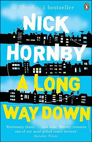
I picked up this book with my copy of The Independent as it was a bargain at £2.99. Again I always judge a book by its cover, this is a usual book I would pick up and it was really good!

The story is mainly about archaeology and when a mummy that is undocumented turns up and the post mortem shows the supposed Egyptian "mummy" has fillings and a bullet in its leg.

Then when another body that has been presevered by ancient techniques turns up, the heat is really on to find the archaeology killer!

I really enjoyed this book and it picked up a lot halfway through when the background of the characters become more exposed. If you like thrillers combined with horror and history then this would be perfect for you.

Wednesday 23 September 2009

Worthy to be an X-Factor Judge?

If you haven't heard Cheryl Cole's new single, its probably not worth wasting your time; but if like me you were interested in seeing the video that goes with the below par debut solo single. (Heartbreaker with Will.I.AM doesn't count as a debut)

The video did not disappoint, Cheryl is too thin and ruins her normal fashionable self by wearing leopard print pajama pants.


I am an avid Cheryl Cole fan and this song and video really really do disappoint. The song although not great could have been saved by a decent video, that didn't show Cheryl scrawled all over the place or even if it had a plausible inspiration behind it. When you look at the more worthy stars out there for example Beyonce; who recently won Video of The Year Award at the VMA's for Single Ladies (Put a Ring on it) where she truely proves less is more.

All she needed was a sexy outfit and a white drop background combined with her fantastic dancing ability. No need to over complicate the idea. Unlike Cole's fussy video. Such a Shame.

BeyonceSingleLadies9.jpg image by xpd154ccc


If you do want to see the video click here:

http://www.youtube.com/watch?v=XMiy_UsrPDs

Holly Fulton as Recommended by Victoria Beckham

If something is highly regarded by Mrs Beckham, is it worth a look, well I thought so, as the Telegraph stated:

"Mrs Beckham’s favourite collection was the Art Deco, Empire State Building-inspired collection by the Royal College of Art graduate, Holly Fulton. Crystals, beading and plastic graphics created dazzling architectural motifs on her leather, silk and PVC designs, in black and white, aquamarine and yellow, with matching neckpieces"


So I visited her website to see what all the fuss was about, at first glance you see bright colours, geometric lines, sturdy structures and great attention to detail. She uses bright decorative surfaces as her main focus and she points out: " I am constantly endeavouring to create a challenging yet beautiful surface which pushes the boundaries of modern fashion."

I found it very interesting to see how she works up her designs, she draws each up extensively and works through each with different references with "constant re-interpretation." She uses different types of materials to re-represent her work from crystallized elements to electrical cables, which again brings different elements and ideas to the design.

Her main influences are Art Deco and Bauhaus with there strong forms and cubist fashion is another major theme she enjoys. Obviously from her designs there is a lot of surface decoration which is beautiful yet time consuming.

I am loving this designer right now, if you want to see her full catwalk show at the London Fashion week visit: http://www.hollyfulton.com/


Tuesday 22 September 2009

Vitamin Water?

Right, so with my boots meal deal there is a large variety of drinks to choose from; coca cola, evian, milk, etc, etc. The last three times I have been on my lunch break, I have opted for Vitamin Water. Why??


I can honestly hand on my heart say it is because the packaging looks so damn good, its simple yet so obviously effective. The best thing is that I don't even think they work, e.g. raspberry and apple is for defence;  "keeps you perky when your feeling murky." It clearly didn't work for me but yet the next day I went back to boots and bought another, maybe to see if that one would work and I can quite easily admit that the next time I go I will be trying another, because although I don't think the "vitamin' goodness does anything they actually do taste good.

 All these thoughts about packaging and how easily I was led to buy this product made me think would I have still bought it were it not part of the £2.99 meal deal and I can safely say that I would not; as it does cost more than half of a combined meal deal! So that just goes to show that it doesn't matter how good your advertising, if the price ain't right it's not going to shift!

Monday 14 September 2009

This is It

How fantastic is this image, so iconic. Such a great way to remember the legend himself. 
   
This has actually just given me goosebumps. It actually makes me even more devasted that I actually had tickets to go and see him live. This film though looks like a must see, especially as its only in cinemas for 2 weeks.
The composition of the music for this trailer is great, it just reinforces how influential and how brilliant his music actually was and also how his music will live on. This trailer had to be big and over the top and obviously it is, the trailer was shown exclusively on MTV during the Video Music Awards. This is a great example of choice of placement of certain advertisements where better to advertise that on MTV during the VM Awards. Although this was obviously a rushed trailer and film, but has had time and money spent on it and hopefully if I get to see the film (you have to book your tickets in advance) it will deliver the quality and production value MJ would have been proud of.
RIP -MJ

Cool Haus

I don't even know how I came across this but I adore it!

Cool Haus make ice cream sandwiches, designed and made by two architects; Natasha Case and Freya Estreller.

Cool Haus is the first project under Natasha and Freya’s company that explores the connections between food and architecture, the purchased and revamped an old truck that they found on craigslist, then launched Cool Haus at the Coachella festival.


The Cool Haus service works like this:


Plus an edible wrapper, with Art Mortimers mural that appears on the side of The Brig


Here is the outcome... dependent on your preferences.

I love this idea and the logo, it is so appropriate to the company and the target audience. Despite this being such a huge success in the states, I don't think it is warm enough to really work here, unless it was inside a shopping centre like Millie's Cookies.

I have looked into a few descriptions of the company and they seem to be all for natural ingredients and minimizing waste, e.g edible wrapping. This idea is so original and very contemporary, it would be interesting to see more food explored through the eyes of two architects e.g. pizzas.. like the leaning tower of pisa. Maybe it wouldn't work the same though?

Sunday 13 September 2009

Sex and The City - Product Placement

So we are all talking about product placement, this is an example of  the eccentric product placement that happens in America. This fictitious ad created specifically for a scene in SATC, where Samantha "creates" the ad to boost her toyboys struggling modelling/acting career.
This ad produced a huge amount of positive publicity for the brand, would this be acceptable here. I think it definitely would obviously not on Coronation Street but something more appropriate.
""This is product placement taken to new heights," said Patrick O'Neill, the group creative director of TBWA, the agency responsible for the work."
The actor Jason Lewis later sued Absolut because he says the company cashed in on the publicity by using it online, they marketed the ad as actual and that the company created a "absolut hunk" cocktail without his permission.
Admirably Lewis stated he has always tried to avoid work connected to  advertising "alcohol, guns, tobacco and nudity" he says the ad should not have been used outside the show. Unfortunately I think SATC advertises all those things bar guns, so maybe this statement is slightly hypocritical, although I do believe they should have gotten his consent before slapping this image everywhere.
Despite all this I think this product placement is amazing, it is so appropriate for the show and for its viewers and aslong as the product placement here is appropriate to the programming it should all work out for the best

Guy Portelli

I watched this guy appear on dragons den, he seemed quite quiet but had an amazing collection of work.

"Guy Portelli from Tonbridge was given the money for a 25% share in Pop Icons, a series of models depicting musicians such as John Lennon and Bob Marley."

He appeared on series 6 of Dragons Den in 2008 and I watched a show the other day where the Dragons caught up with entrepeneurs, he was doing fabulously well, so I decided to do a bit of research into him.

Some of his work is absolutely beautiful and gives me the urge to go out and buy a lot of crafty stuff to start making sculptures and I'm sure thats what art is all about; as well as apreciating it of course!!

  "Excess"
Amy Winehouse straddling a broken bottle of champagne. I like the idea behind this more that the sculpture itself, it is all about Amy's excess lifestyle and however beautiful it may appear on the outside, on the inside things are falling apart. This was the opening sculpture at his exhibition.
"Imagine"
John Lennon inspired by Lennon's own self portraits. Simplistic, yet you know who it is straight away.
 
"Grace Jones"
Uses influences such as futurism and pop art, specifically Andy Warhol. I think this style captures Grace Jones in a very masculine way, yet the smooth sculpting technique allows you to also see that this is a women.

"What You Want"
Spice Girls were a formed pop group, packaged specifically for the teenage market this piece is all about fun and the girls erupt into a sculpture using sweets prom a pick and mix bag. This piece is so fun, I'm not sure though that you would know it was the spice girls, but it is a good piece of influential art.
"Hey Joe"
Taking ideaology from the 1960s and flower power, this sculpture is Henrix, both poet and politican "rising out of the ashes" My favourite of the pop art collection, I am a big fan of this mosaic style combined with aluminum and bronze, it is very cutting. I really would like this on my wall!
See more from the Collection: www.portelli-popicon.co.uk
 
"Dream Catcher"
A memorial sculpture for Becky Earland. Hillview school, Tonbridge 
I absolutely adore this piece, it is so intricate and pretty, I especially like the fact the people at the bottom spell out Becky's name.

Wednesday 9 September 2009

Is Advertising to Blame for Binge Drinking?


After watching the news yesterday and doctors asking to bring about a ban on advertising alcohol and drinks promotions, I've been asking myself is advertising to blame for young people's binge drinking?

I can't see why advertisers should take all the blame, I mean its not like we as humans don't have any self control. I do also believe that not all advertising is effective so it is convenient that the government has decided it is all to do with advertising and not to do with the fact alcohol can be bought so cheaply, or that by putting age restrictions on these products they entice young people.

Today the BMA has made reccomendations that the branding of alcohol not be so specific to young people or to "not appeal" to young people.

In my opinion the anti-drinking: Alcohol Know Your Limits: "you wouldn't start your night like this so why end it this way" are much more effective and I actually take more note of these adverts in comparison to the smirnoff moscow mule circus themed adverts.

What do you think?

Tuesday 8 September 2009

What are We Like?

 At Manchester Art Museum last month they had on an exhibition called What Are You Like.
The exhibition is based around a parlour game from the Victorian times that asks you to describe yourself with images of your favourite things: (illustrating 8 from a list of 12)

favourite....
+animal
+book
+item of clothing
+comfort
+food
+past time
+place
+possession
+music
+shoes
+weather 
+pet aversion (the thing they love to hate!) 
 
The exhibition is 45 famous names including Eric Clapton, Quentin Blake and Paul Smith, revealing their favourite things through wonderfully thoughtful illustration.

The result is a delightfully eccentric exhibition.
 
This 3d illustration by Laura Carlin, was very different to all the other pieces and you had to look at it from every angle to fully appreciate the full illustration. The fact that there is no colour adds to the simplicity and the delicacy of it all. Not my favourite but very high up.
This illustration by Sara Fanelli  is very different to Laura Carlin's piece and less delicate but it has a very laid back feel to it, it reminds me of the doodles I used to created when very bored at school! It still looks very artistic and interesting.
  
This was one of my favourites by Jan Pienkowski, it was very textural although you can't tell from this image, but it was a montage of all Pienkowski's favourite things, unlike the other illustrations this made a complete image rather than treating each favourite thing as a seperate illustration. Then to make clear of which questions he had answered they are listed in the top left hand corner.
  
This was a very fashionable piece done by Paul Smith, very quirky and also reminds me of Paul Smith advertising and how they fashion their shop fittings!

These are just a few, more can be found at: http://www.houseofillustration.org.uk/wayl.php

Monday 7 September 2009

The Complete Roberta Breitmore at the Whitworth.

By far one of the most complicated exhibitions I have ever seen, even after I left I was still wondering about it.. is this maybe a good thing?
Lynn Hershman investigates a simulated person who interacts with real life in real time.  

Roberta is constructed through drawings, clothing and wigs and then four years later she is exorcised.
Roberta Breitmore was for FOUR YEARS a private performance of a simulated person.

It is so bizarre, Roberta was given childhood data before she was allowed into the world and her first action was to place an ad in a local newspaper for a roommate.

People who answered became part of the performance, "As she became part of their reality, they became part of her fiction."

The artist : Lynn Hershman, was often accused of being Roberta, although she insisted she was her "own women" Roberta represented a large part of Lynn. Lynn states: "For years my daughter denied she was related to me. People assumed I was schizophenic."

It was really interesting to see all the paper work for example; physciatrists notes etc and art work of this fictious persona. It also included clothes and Roberta's wig.

To fully understand this surreal exhibition more information can be found here:

David Beckham's Affair with Ellen

Who says photoshop doesn't have it uses?

I reckon they make a good couple.

Well done Ellen!

Sunday 6 September 2009

State of The Art: New York

I recently went to a Exhibition called State of the Art: New York, it focuses on the influence that the "Big Apple" has on artists from America and around the world.
One artist it drew my attention to was: Kenneth Tin-Kin Hung.

Residential Erection is devoted to the 2008 US Presidential Election, although I believe its audience to be a more American side, this witty cartoon montage is quite funny. Tin-Kin Hung has many followers due to his intersection of popular culture, mixed with current affairs and his talent of manipulating different media.

This animation casts the 2008 Presidential candidates into different identities including: Borat Obama and John McCain the Donkey-cheerleader, which left my friend actually asking; "can they even do that!?"
Some of the content is so naughty!  The Fagbug, 50 Cent the Crossdresser and nothing containing American stupidity is complete without Britany Spears half naked.
The animation along with its precisely researched narration takes a huge dig at the hypocrisy of recent political times. The music which adds more insult along with the internet-scavenged imagery and original animation creates a hugely intriguing piece of art work.
Unfortunately I can't get a you-tube video: http://www.tinkin.com/arts/residential-erection/

An Equal Stillness

I am currently reading a book called An Equal Stillness by Francesca Kay. This isn’t the usual genre I would choose to read normally I am more interested in Crime/Horror/Thrillers.


The novel, Kay’s debut, is set in the 1900s and details the life of Jennet Mallow a talented artist and mother, it follows her struggle with married and family life and the lack of time this leaves to fulfill her artistic passion.

The most fascinating aspect to this book is the descriptions of fictional pieces of art work:


'Those overlays of net and silk are there to add a new dimension  and to deepen the illusion of cloud and mist that imbues so much of Jennet Mallow's painting in that period. And Yet these veils are symbolic, as, in later work, would be her tightened strings and wires.Curators in public spaces would often hang the paintings with their coverings looped back or drawn half way to reveal the underlying paint and to stop visitors from lifting the veils themselves. But however transparent they may be, or pushed aside, they still whisper ambiguity; simultaneously revealing and concealing.'


I am quite a fast reader but this book has taken me a couple of weeks to read, as parts I just needed to read again not because I didn’t understand but because there were many levels to the writing.

Although I bought this book because it was a Times Recommended Read of The Week, the front cover is an imitation water painting of Jennet with Sandiago in the background. The colours attract the eye and the style is an intriguing wash which some how draws the eye.


Monday 31 August 2009

Alix Malka

Parisian fashion photographer - amazing.


I don't really need to say much apart from, I am fascinated by this style of underwater photography and thought maybe these photographs are so intriguing because they are in water and because of the style and design of the dresses???

I thought wrong, these non underwater photos are equally as interesting.

I thought of these photos americas next top model style after reading normoyle: http://normoyle.blogspot.com/2009/08/rosenthal.html